Lessons from the COVID data wizards: what have we learnt about communicating science in a crisis?
In March 2020, Beth Blauer started hearing anecdotally that COVID-19 was disproportionately affecting Black people in the United States. But the numbers to confirm that disparity were “very limited”, says Blauer, a data and public-policy specialist at Johns Hopkins University in Baltimore, Maryland.
The architects of these dashboards put in long hours and faced considerable challenges, including incomplete and inconsistent data, misconceptions and misunderstandings about how the information was collected, and efforts to twist the messages that the dashboards present.
Ritchie also fears that the gains that have been made in data collection and visualization could easily be lost before the global pandemic is over. “A lot of these data projects are seen as one-off things,” she says. “As rich countries start to get more back to normal because of high vaccination rates, for example, will they turn around and just let these projects die?” Some dashboards have already stopped their efforts.
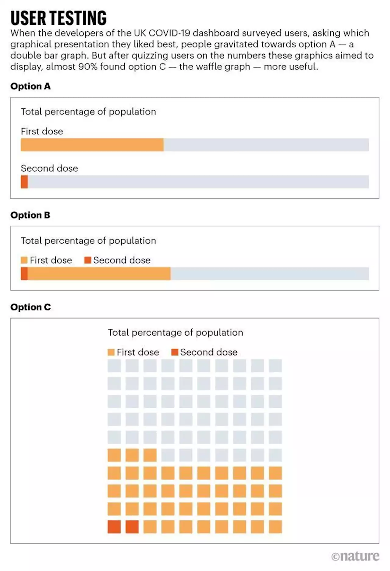
His team regularly surveys dashboard users to see how well the visualizations are understood. In February 2021, for example, he asked users which of the three vaccination visuals they liked the best. Importantly, the team also quizzed the participants on their interpretation of those graphics. People tended to prefer a bar-chart option that looked “simple and very nice”, says Hadjibagheri, but they couldn’t accurately identify the proportions it represented.
The team subsequently set up automatic feeds so that organizations could subscribe to their announcements directly. It also decided to delay posting data with big gaps in the future. Hadjibagheri had been increasing his social-media activity since about November 2020. He says that trust in his service, based on user surveys, subsequently rose by nearly 35%.
The numbers, however, were based on an inaccurate estimate of the pool of unvaccinated people. When a more appropriate estimate was used, case rates among unvaccinated individuals were shown to be higher than for unvaccinated people in nearly all age groups. The agency was sharply criticized for releasing the misleading figures.